Button Tutorial
This tutorial describes the button controls including, PushButton, Checkbox, Radio and Toggle.
In this tutorial the following subjects are covered:
Button creation with Visuals
Button events
Overview
The Button class is the base class for the button UI components.
Buttons can be disabled.
Buttons can be made togglable. and then selected or unselected
A push button changes its appearance when pressed, and returns to its original appearance when released.
The check box can be checked or unchecked.
The radio button has two states selected and unselected. Usually radio buttons are grouped, in a group only one radio button can be selected at a given time.
The toggle button allows the user to switch a feature on or off. Toggle buttons also support tooltips.
Button creation with Visuals
Using Visuals
Below Example of PushButton sets the SELECTED_BACKGROUND_VISUAL as “pressed-image-file.jpg” and the UNSELECTED_BACKGROUND_VISUAL as “unselected-image-file.jpg”
Tizen 3.0
UNSELECTED_BACKGROUND_VISUAL = Dali::Toolkit::Button::Property::UNSELECTED_STATE_IMAGE.
SELECTED_BACKGROUND_VISUAL = Dali::Toolkit::Button::Property::SELECTED_STATE_IMAGE.
DISABLED_UNSELECTED_BACKGROUND_VISUAL = Dali::Toolkit::Button::Property::DISABLED_STATE_IMAGE.
Buttons can contain various Visuals not just ImageVisual.
Below is an example using ImageVisual, TextVisual and ColorVisual
Setting ImageVisual to a Button using a Property Map
Right button (Red) is when the button is selected.
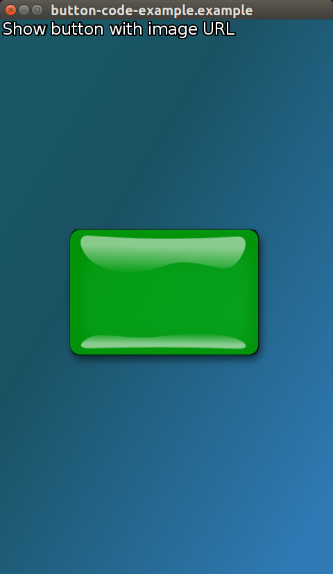
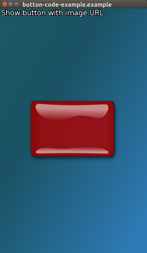
Selected and unselected images are provided to the button as two property maps containing the required URL.
...
PushButton button = PushButton::New();

button.SetProperty( Button::Property::SELECTED_STATE_IMAGE,
                    Property::Map().Add( Visual::Property::TYPE,  Visual::IMAGE )
                    .Add( ImageVisual::Property::URL, DEMO_IMAGE_DIR "red-button.png" )
                    );

button.SetProperty( Button::Property::UNSELECTED_STATE_IMAGE,
                    Property::Map().Add( Visual::Property::TYPE,  Visual::IMAGE )
                    .Add( ImageVisual::Property::URL, DEMO_IMAGE_DIR "green-button.png" )
                    );

button.SetParentOrigin( ParentOrigin::CENTER );
mView.Add( button );  // Adding button to stage via mView which is a staged control.
Setting Text to a PushButton using a Property Map (Full Control)
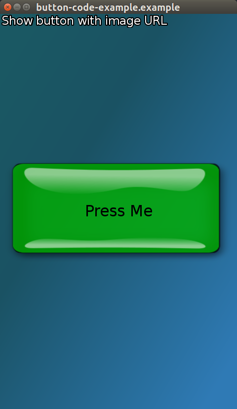
Toolkit::PushButton button = Toolkit::PushButton::New();
Property::Map textSettingsMap;
              textSettingsMap.Add( Visual::Property::TYPE, Toolkit::Visual::TEXT )
                             .Add( TextVisual::Property::TEXT, "Press Me" )
                             .Add( TextVisual::Property::MULTI_LINE, true )
                             .Add( TextVisual::Property::POINT_SIZE, 12.0f );

button.SetProperty( Toolkit::Button::Property::LABEL, textSettingsMap );
Setting a ColorVisual to a PushButton using a Property Map
Toolkit::PushButton button = Toolkit::PushButton::New();
Property::Map visualSettingMap;
              visualSettingMap.Add( Visual::Property::TYPE, Toolkit::Visual::COLOR )
                              .Add( ColorVisual::Property::MIX_COLOR, Vector4( R, G, B, 1.0f ) );

button.SetProperty( DevelButton::Property::UNSELECTED_BACKGROUND_VISUAL, visualSettingMap );

OR

button.SetProperty( Toolkit::Button::Property::UNSELECTED_STATE_IMAGE, visualSettingMap );
Setting a ColorVisual for the background and a TextVisual for the Label.
Using the above ColorVisual and TextVisual to have a color background with text in the foreground.
Toolkit::PushButton button = Toolkit::PushButton::New();
Property::Map visualSettingMap;
              visualSettingMap.Add( Visual::Property::TYPE, Toolkit::Visual::COLOR )
                              .Add( ColorVisual::Property::MIX_COLOR, Vector4( R, G, B, 1.0f ) );

button.SetProperty( Toolkit::Button::Property::UNSELECTED_STATE_IMAGE, visualSettingMap );

Property::Map textSettingsMap;
              textSettingsMap.Add( Visual::Property::TYPE, Toolkit::Visual::TEXT )
                             .Add( TextVisual::Property::TEXT, "Press Me" )
                             .Add( TextVisual::Property::MULTI_LINE, true )
                             .Add( TextVisual::Property::POINT_SIZE, 12.0f );

button.SetProperty( Toolkit::Button::Property::LABEL, textSettingsMap );
Setting Text to a Button using a string (Basic)
Toolkit::PushButton button = Toolkit::PushButton::New();
button.SetProperty( Toolkit::Button::Property::LABEL, "Select" );
Check box button set up
Two checkboxes with default selected and unselected images.
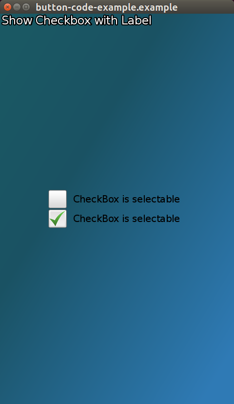
Toolkit::CheckBoxButton checkboxButton1 = Toolkit::CheckBoxButton::New();
checkboxButton1.SetProperty( Toolkit::Button::Property::LABEL, "CheckBox is selectable" );
checkboxButton1.StateChangedSignal().Connect( this, &ButtonCode::CheckBoxSelected );
checkboxButton1.SetParentOrigin( ParentOrigin::CENTER );
checkboxButton1.SetAnchorPoint( AnchorPoint::BOTTOM_CENTER );
checkboxButton1.SetName("one");

Toolkit::CheckBoxButton checkboxButton2 = Toolkit::CheckBoxButton::New();
checkboxButton2.SetProperty( Toolkit::Button::Property::LABEL, "CheckBox is selectable" );
checkboxButton2.StateChangedSignal().Connect( this, &ButtonCode::CheckBoxSelected );
checkboxButton2.SetParentOrigin( ParentOrigin::CENTER );
checkboxButton2.SetAnchorPoint( AnchorPoint::TOP_CENTER );
checkboxButton2.SetName("two");

mView.Add( checkboxButton1 );
mView.Add( checkboxButton2 );
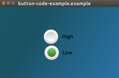
Radio buttons set up in a Group
Radio buttons parented to the same control only allow one to be selected at any time.
Control mView = Control::New();

Toolkit::RadioButton radioButton1 = Toolkit::RadioButton::New();
radioButton1.SetProperty( Toolkit::Button::Property::LABEL, "High" );
radioButton1.SetParentOrigin( ParentOrigin::CENTER );
radioButton1.SetAnchorPoint( AnchorPoint::BOTTOM_CENTER );
radioButton1.SetName("one");

Toolkit::RadioButton radioButton2 = Toolkit::RadioButton::New();
radioButton2.SetProperty( Toolkit::Button::Property::LABEL, "Low" );
radioButton2.SetParentOrigin( ParentOrigin::CENTER );
radioButton2.SetAnchorPoint( AnchorPoint::TOP_CENTER );
radioButton2.SetName("two");

mView.Add( radioButton1 );
mView.Add( radioButton2 );
Toggle button set up
ToggleButton toggleButton = ToggleButton::New();
Button events
There are 4 events associated with the Button class:
- Clicked - The button is touched, and the touch point doesn’t leave the boundary of the button.
- Pressed - The button is touched
- Released - The button is touched, and the touch point leaves the boundary of the button.
- StateChanged - The button’s state is changed.
Here is an example of adding an event handler to a push button Clicked event:
  button.ClickedSignal().Connect( this, &ButtonClicked );

  bool ChangeImageClicked( Button button )
  {
    ...
    // button pressed
    return true;
  }
Events are not fired when the disabled property is set to true.
The Button class provides the following properties which modify the fired events:
- When autorepeating is set to true, the Pressed, Released and Clicked events are fired at regular intervals while the button is touched.
The interval times can be modified with the InitialAutoRepeatingDelay and NextAutoRepeatingDelay properties.
A togglable button can’t be autorepeating. If the autorepeating property is set to true, then the togglable property is set to false but no event is fired.
- When togglable is set to true, a StateChanged event is fired, with the selected state.
For a checkbox all 4 events are available, usually only the StateChanged event is used to notify when the button changes its state to selected or unselected.
For a radio button use the StateChanged event to check when the radio button is selected.