Text Label Tutorial
This tutorial describes the TextLabel control in detail.
In this tutorial:
Text Label creation
Font selection
Multi-language support
Text alignment
Label decorations
Auto scrolling
Mark style
Text Label Properties
Overview
The TextLabel is a NUI control which renders a short text string.
Text labels are lightweight, non-editable and do not respond to user input. Text labels also offer multi-language support.
Basic creation and usage
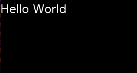
TextLabel label = new TextLabel("Hello World");
Window window = Window.Instance;
window.Add(label);
The label must be added to the Window, or to a View which is on the Window.
The position of the label on-screen is dependent on the parentOrigin property.
This image shows a text label
To display a TextLabel the Text property must be set using a UTF-8 string. Note: CR+LF new line characters are replaced by LF.
Font Selection
By default the TextLabel will automatically select a suitable font from the platform. Note; that the selected font may not support all characters in your input text. For example, Latin fonts often do not provide Arabic glyphs.
Alternatively you can request a font using either or all, of FontFamily, FontStyle, and PointSize properties:
-
Font Family Is a string with the font’s family name. i.e. FreeSerif
- Font Style
Is a JSON formatted string with the font’s style. Possible key, value pairs are:
- width Modifies the space between glyphs. Commonly used values are:
- condensed
- semiCondensed
- normal
- semiExpanded
- expanded
- weight Modifies the thickness or darkness of the glyphs. Commonly used values are:
- thin
- light
- normal
- regular
- medium
- bold
- slant Whether to use italics. Usually italic is a different font, whilst the oblique has been generated by slanting the normal one. Commonly used values are:
- normal
- roman Same as normal
- italic
- oblique
- width Modifies the space between glyphs. Commonly used values are:
- Point Size Is a float with the font’s size in points. To get the point size from pixels, could use the formula: point_size = 72 * pixels / vertical_dpi where vertical_dpi is the device’s vertical resolution in dots per inch.
label.FontFamily = "FreeSerif";

PropertyMap fontStyle = new PropertyMap();
fontStyle.Add( "weight", new PropertyValue("bold") );
fontStyle.Add( "slant", new PropertyValue("italic") );
label.FontStyle = fontStyle;
label.PointSize = 12.0f;

If fonts are not specified, styling defaults are used.
Font Styles
Setting a font size programmatically is not ideal for applications which support multiple screen resolutions, and platforms which support multiple logical font sizes. Also, any changes to the platform font settings will override any sizes that have been programmatically set.
A more flexible approach is to prepare various JSON stylesheets, and request a different style for each platform. The NUIApplication class has constructors which take a stylesheet argument:
class Example : NUIApplication

...
...

Example example = new Example("example-path/example.json");
To change the font for standard text controls, this JSON syntax can be used:
{
  "styles":
  {
    "textlabel":
    {
      "fontFamily":"FreeSerif",
      "fontStyle":
      {
        "weight":"bold",
        "slant":"italic"
      },
      "pointSize":8
    }
  }
}
However the same pointSize is unlikely to be suitable for all text controls in an application. To define custom styles for existing controls, simply set a style name for each case, and then provide a style override in JSON.
Mapping (in the stylesheet) the logical size to a physical size, can provide further flexibility for the end user.
Multi - language support
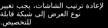
Text labels offer multi-language support, including ‘right to left’ languages such as Arabic.
An example of Arabic can be seen in the images in the Text Alignment section.
See also Font Selection
Text Alignment
Wrapping can be enabled using the MultiLine property:
label.MultiLine = true;
The text can be aligned horizontally to the beginning, end, or center of the available area:
label.HorizontalAlignment = HorizontalAlignmentType.Left;
label.HorizontalAlignment = HorizontalAlignmentType.Center;
label.HorizontalAlignment = HorizontalAlignmentType.Right;
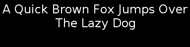
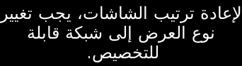
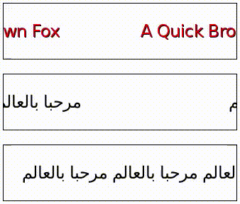
| Here is the “BEGIN” alignment shown for left-to-right (Latin) | right-to-left (Arabic) scripts |
 |
 |
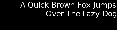
| Here is the “CENTER” alignment shown for left-to-right (Latin) | right-to-left (Arabic) scripts: |
 |
 |
| Here is the “END” alignment shown for left-to-right (Latin) | right-to-left (Arabic) scripts: |
 |
 |
The examples above assume that the label size is greater than the minimum required. Back to top
TextLabel Decorations
Color
To change the color of the text, the recommended way is to use the TEXT_COLOR property.
This will not affect children added to the TextLabel.
label.Text = "Red Text";
label.TextColor = Color.Red;

Drop Shadow
To add a drop-shadow to the text, simply set the Shadow property. Shadow parameters can be set through a JSON string, as demonstrated below.
window.BackgroundColor( Color.Blue );

label1.Text = "Plain Text";

label2.Text = "Text with Shadow";
PropertyMap shadow = new PropertyMap();
shadow.Add("offset", new PropertyValue("1 1"));
shadow.Add("color", new PropertyValue("black"));
pixelLabel.Shadow = shadow;

label3.Text = "Text with Bigger Shadow";
PropertyMap shadow = new PropertyMap();
shadow.Add("offset", new PropertyValue("2 2"));
shadow.Add("color", new PropertyValue("black"));
label3.Shadow = shadow;

label4.Text = "Text with Color Shadow" );
PropertyMap shadow = new PropertyMap();
shadow.Add("offset", new PropertyValue("1 1"));
shadow.Add("color", new PropertyValue("red"));
label4.Shadow = shadow;


Underline
Text underline properties can be set using a property map.
Here text is underlined:
label1.Text = "Text with Underline";

PropertyMap textStyle = new PropertyMap();
textStyle.Add("enable", new PropertyValue("true"));
label1.Underline = textStyle;
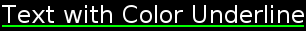
Here the underline color and height is set:
label2.Text = "Text with Color Underline";

PropertyMap textStyle = new PropertyMap();
textStyle.Add("enable", new PropertyValue("true"));
textStyle.Add("color", new PropertyValue(Color.Green));
label2.Underline = textStyle;

By default the underline height will be taken from the font metrics, however this can be overridden:
PropertyMap textStyle = new PropertyMap();
textStyle.Add("enable", new PropertyValue("true"));
textStyle.Add("height", new PropertyValue(2.0f)); // 2 pixel height
label1.Underline = textStyle;
The underline images above have a 1 pixel height.
Auto Scrolling
Auto TextLabel scrolling enables the text to scroll within the control, it can be used if text exceeds the boundary of the control, hence showing the full content. Autoscrolling will also scroll text that is smaller than the control, ensuring that the same bit of text is not visible at the same time, this gap can be configured to be larger.
The loop count sets the number of scrolling repetitions i.e. if loop count is set to 3, scrolling of the text will occur 3 times.
If the loop count is 0, then once triggered to start, scrolling will continue until requested to stop.
Multi-line text will not scroll, and text should be ‘Begin’ aligned.
The EnableAutoScroll property should be set to TRUE to enable scrolling:
label.EnableAutoScroll = true;
Once enabled, scrolling will continue until the loop count is completed, or EnableAutoScroll is set to false. Setting EnableAutoScroll to false will let the text complete it’s current scrolling loop then stop.
The scroll speed, gap and loop count can be set in the stylesheet or via these relevant properties:
Auto scroll speed
The AutoScrollSpeed property controls the speed of the scrolling, the speed should be provided as pixels/second.
Auto scroll loop count
AutoScrollLoopCount specifies how many times the text will complete a full scroll cycle. If this property is 0, then scrolling will continue until EnableAutoScroll is set to false.
Setting EnableAutoScroll to false will stop scrolling, whilst maintaining the original loop count value for next start.
Auto scroll gap
This specifies the amount of whitespace to display before the scrolling text is shown again. This gap will be increased if the given value is not large enough to prevent the same bit of text being visible at two locations in the control.
Provide the distance in pixels.
Scroll Direction
The scroll direction is chosen automatically with the following rules:
| text line format | Action |
|---|---|
| single-lined | scroll left when the text is Left to Right (LTR) |
| or scroll right if text is Right to Left (RTL). | |
| multi-lined | scroll upward |
Mark-up Style
Mark-up tags can be used to change the style of the text.
By default the text controls don’t process the mark-up string. To enable the mark-up string processing the property EnableMarkup must be set to true.
TextLabel label = new TextLabel("Hello World");
label.EnableMarkup = true;
Window window = Window.Instance;
window.Add(label);
Note the mark-up processor doesn’t check the correctness of the mark-up string. This may cause the text to be badly rendered.
There are priorities when styles are applied while rendering text.
Current supported tags are:
<color>
Sets the color of the characters inside the tag. The color tag has a value attribute used to set the color. Possible values are: ‘red’, ‘green’, ‘blue’, ‘yellow’, ‘magenta’, ‘cyan’, ‘white’, ‘black’ and ‘transparent’. Web color and 32 bits hexadecimal 0xAARRGGBB formats are also supported.
The examples below are equivalent, the first example renders the text in red. Second example codes the color in 0xAARRGGBB.
label.Text = "<color value='red'>Red Text</color>" ); // Color coded with a text constant.
label.Text = "<color value='0xFFFF0000'>Red Text</color>" ); // Color packed inside an ARGB hexadecimal value.
<font>
Sets the font values of the characters inside the tag.
Supported attributes are:
- family The name of the font.
- size The size of the font in points.
- weight The weight of the font.
- width The width of the font
- slant The slant of the font.
See Font Selection
label.Text = "<font family='SamsungSans' weight='bold'>Hello world</font>";
Text Label Properties
The properties available for TextLabel are:
| Property | Type | Description |
|---|---|---|
| Text | string | The text to display in UTF-8 format. |
| FontFamily | string | The requested font family to use. |
| FontStyle | Map | The requested font style to use. |
| PointSize | float | The size of font in points. |
| MultiLine | bool | The single-line or multi-line layout option. |
| HorizontalAlignment | string | The line horizontal alignment. |
| VerticalAlignment | string | The line vertical alignment. |
| TextColor | Color | The color of the text. |
| ShadowOffset | Vector2 | The shadow offset of the text. |
| ShadowColor | Vector4 | The shadow color of the text. |
| UnderlineEnabled | bool | Gets/sets whether to use underline. |
| UnderlineColor | Vector4 | Gets/sets the color of underline. |
| UnderlineHeight | float | Gets/sets the height of underline. |
| EnableMarkup | bool | Whether the mark-up processing is enabled. |
| EnableAutoScroll | bool | Starts or stops auto scrolling. |
| AutoScrollSpeed | int | Sets the speed of scrolling in pixels per second. |
| AutoScrollLoopCount | int | Number of complete loops when scrolling enabled. |
| AutoScrollGap | float | Gap before scrolling wraps. |
| LineSpacing | float | The default extra space between lines in points. |
| Underline | Map | The default underline parameters. |
| Shadow | Map | The default shadow parameters. |
| Emboss | Map | The default emboss parameters. |
| Outline | Map | The default emboss parameters. |
| PixelSize | float | The size of font in pixels. |
| Ellipsis | bool | Gets/sets whether to enable the ellipsis. |
| AutoScrollLoopDelay | float | Gets/sets the loop delay of auto scroll. |
| AutoScrollStopMode | AutoScrollStopMode | Gets/sets the stop mode of auto scroll. |
All text label properties are writable.
Text label properties are not animatable.
More information on the Text label
The Hello World tutorial describes how to display text in a text label.