Visuals Tutorial
This tutorial describes how to create, register and use visuals.
Overview
Visual Properties
Visual Type
Visual Creation and Registration
Visual Depth Index
Example of Visuals in use
The Color Visual
The Gradient Visual
The Image Visual
The Border Visual
The Mesh Visual
The Primitive Visual
The Wireframe Visual
The Text Visual
The Visual transform
The Visual map class
The Visual view class
Overview
Visuals provide reusable rendering logic.
Visuals are the main building block of controls.
Visuals reuse geometry, shaders etc. across controls, and manage the renderer and texture existance when the control is been displayed.
Additionally visuals, respond to View size and color change, while also providing clipping at the renderer level.
Visuals are configured via properties.
To create a visual:
- Create a property map
- Add visual ‘type’ to property map (must be first entry in property map)
- Add required property values to the map
- Create visual in a ‘factory’ using a property map
- Register visual
Example of Visuals in use - button styling
Images, icons and text are added to buttons using visuals.
A control has 3 states - NORMAL, FOCUSED and DISABLED. Buttons have sub states: SELECTED and UNSELECTED. The button’s appearance can be modified by setting properties for the various ‘state’ visuals. Each state and sub-state should have the required visuals. A visual can be common between states.
When a button is pressed it moves from the Unselected state to the Selected state. The Unselected visuals are replaced by the Selected visuals.
When the button is disabled, Background, Button and Selected visuals are replaced by their ‘disabled’ visuals.
The styling tutorial explains how to build up and transition visuals, for the button states using JSON stylesheets.
Visual Properties
Visual properties are set through a property map.
There are 2 methods of using property maps:
- Specific ‘property’ structures for each visual, e.g.
ColorVisualProperty. These structures specify the properties of each visual type. The properties for each visual are listed in the respective ‘Properties’ sub-section. - Visual maps, e.g.
ColorVisualsee using a VisualMap.
This tutorial illustrates both methods.
Visual Type
The Type Enum specifies the visual to use/create. This is required to avoid ambiguity, as multiple visuals may be capable of rendering the same contents.
The following visual types are available:
| Type |
|---|
| Border |
| Color |
| Gradient |
| Image |
| Mesh |
| Primitive |
| WireFrame |
| Text |
| NPatch |
| SVG |
| Animated Image |
‘Type’ should be added to the property map.
Visual Creation and Registration
Visuals are created by factory methods.
Visuals need to be registered with a unique ‘property’ index. The index is used for direct access to the visual.
The index can be used to link a view to a visual when required. Registration also enables extra functionality,
such as connection to the Window. RegisterVisual stores the visual ‘handle’ within the control.
The examples in this tutorial demonstrate the recommended procedure for visual creation and registration, using ‘explicit’ calls to the factory and register methods:
...
...

_colorVisual =  VisualFactory.Get().CreateVisual( colorVisual );

RegisterVisual( ColorVisualPropertyIndex, _colorVisual );

_colorVisual.DepthIndex = ColorVisualPropertyIndex;
However where specific visual assignment is possible, factory creation and registration may occur within the API.
In the following code snippet, visual factory creation and registration occur within the Background property.
textView.Background = textVisual;
The VisualView class AddVisual method, is another example of API ‘inherent’ visual creation.
The snippet above, and the examples for each visual throughout this tutorial use property registration based on a ‘fixed’ property index range. The NUI code base is currently been modified (July 2017) to utilise property registration based on automatic generation of indices. See Properties in custom views.
Visual Depth Index
The ‘depth index’ is the draw order for visuals within a view.
Depth index increases automatically for each added visual.
The last registered visual is always on top.
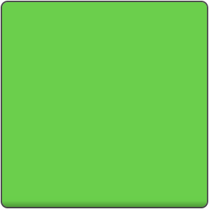
Color visual
Renders a color to the visual’s quad geometry.

Visual.Type : Color
Usage
private const int PROPERTY_REGISTRATION_START_INDEX = 10001000;
private const int ColorVisualPropertyIndex = PROPERTY_REGISTRATION_START_INDEX+1 ;
private const int PrimitiveVisualPropertyIndex = PROPERTY_REGISTRATION_START_INDEX+2;

...
...

private VisualBase _colorVisual;

...
...

PropertyMap colorVisual = new PropertyMap();
colorVisual.Add( Visual.Property.Type, new PropertyValue( (int)Visual.Type.Color ))
           .Add( ColorVisualProperty.MixColor, new PropertyValue( _color ));
_colorVisual =  VisualFactory.Get().CreateVisual( colorVisual );

RegisterVisual( ColorVisualPropertyIndex, _colorVisual );

// Set the depth index for Color visual
_colorVisual.DepthIndex = ColorVisualPropertyIndex;
Properties
| ColorVisualProperty | String | Type | Required | Description |
|---|---|---|---|---|
| MixColor | VECTOR4 | Yes | The color required. |
VisualMap : ColorVisual
Gradient Visual
Renders a smooth transition of colors to the visual’s quad geometry.
Both Linear and Radial gradients are supported.
| Linear | Radial |
|---|---|
 |
 |
Visual.Type : Gradient
Usage - radial
_visualView = new VisualView();

...
...

GradientVisual gradientVisualMap1 = new GradientVisual();

PropertyArray stopPosition = new PropertyArray();
stopPosition.Add(new PropertyValue(0.0f));
stopPosition.Add(new PropertyValue(0.3f));
stopPosition.Add(new PropertyValue(0.6f));
stopPosition.Add(new PropertyValue(0.8f));
stopPosition.Add(new PropertyValue(1.0f));
gradientVisualMap1.StopOffset = stopPosition;

PropertyArray stopColor = new PropertyArray();
stopColor.Add(new PropertyValue(new Vector4(129.0f, 198.0f, 193.0f, 255.0f) / 255.0f));
stopColor.Add(new PropertyValue(new Vector4(196.0f, 198.0f, 71.0f, 122.0f) / 255.0f));
stopColor.Add(new PropertyValue(new Vector4(214.0f, 37.0f, 139.0f, 191.0f) / 255.0f));
stopColor.Add(new PropertyValue(new Vector4(129.0f, 198.0f, 193.0f, 150.0f) / 255.0f));
stopColor.Add(new PropertyValue(Color.Yellow));

gradientVisualMap1.StopColor = stopColor;
gradientVisualMap1.Center = new Vector2(0.5f, 0.5f);
gradientVisualMap1.Radius = 1.414f;
gradientVisualMap1.Size = new Vector2(100.0f, 100.0f);
gradientVisualMap1.Position = new Vector2(120.0f, 380.0f);
gradientVisualMap1.PositionPolicy = VisualTransformPolicyType.Absolute;
gradientVisualMap1.SizePolicy = VisualTransformPolicyType.Absolute;
gradientVisualMap1.Origin = Visual.AlignType.TopBegin;
gradientVisualMap1.AnchorPoint = Visual.AlignType.TopBegin;

_visualView.AddVisual("gradientVisual1", gradientVisualMap1);
The actual visual is created in the View AddVisual method.
Note : _visualView is a custom view. See Visual View
Properties
| GradientVisualProperty | Name | Type | Required | Description |
|---|---|---|---|---|
| StartPosition | VECTOR2 | For Linear | The start position of the linear gradient. | |
| EndPosition | VECTOR2 | For Linear | The end position of the linear gradient. | |
| Center | VECTOR2 | For Radial | The center point of the gradient. | |
| Radius | FLOAT | For Radial | The size of the radius. | |
| StopOffset | ARRAY of FLOAT | No | All the stop offsets. If not supplied default is 0.0 and 1.0. | |
| StopColor | ARRAY of VECTOR4 | Yes | The color at those stop offsets. At least 2 required to show a gradient. | |
| Units | INTEGER or STRING | No | Defines the coordinate system. More info | |
| SpreadMethod | INTEGER or STRING | No | Indicates what happens if gradient starts or ends inside bounds. More info |
VisualMap : GradientVisual
Units
Defines the coordinate system for the attributes:
- Start (x1, y1) and End (x2 and y2) points of a line if using a linear gradient.
- Center point (cx, cy) and radius (r) of a circle if using a radial gradient.
Spread Method
Indicates what happens if the gradient starts or ends inside the bounds of the target rectangle.
| Enumeration | Name | Description |
|---|---|---|
| Pad | Default. Uses the terminal colors of the gradient to fill the remainder of the quad geometry. | |
| Reflect | Reflect the gradient pattern start-to-end, end-to-start, start-to-end etc. until the quad geometry is filled. | |
| Repeat | Repeat the gradient pattern start-to-end, start-to-end, start-to-end etc. until the quad geometry is filled. |
Image Visual
Renders an image into the visual’s geometry.
The visual provided, depends on the extension of the image.
- Normal (Quad)
- N-Patch
- SVG
- Animated Image
Visual.Type : Image
Normal
Renders a raster image ( jpg, png etc.) into the visual’s quad geometry.

Usage
PropertyMap imageVisual = new PropertyMap();
imageVisual.Add( Visual.Property.Type, new PropertyValue( (int)Visual.Type.Image ))
           .Add( ImageVisualProperty.URL, new PropertyValue( _imageURL ));
_imageVisual =  VisualFactory.Get().CreateVisual( imageVisual );

RegisterVisual( ImageVisualPropertyIndex, _imageVisual );

// Set the depth index for Image visual
_imageVisual.DepthIndex = ImageVisualPropertyIndex;
Properties
| ImageVisualProperty | Name | Type | Required | Description |
|---|---|---|---|---|
| URL | STRING | Yes | The URL of the image. | |
| FittingMode | INTEGER or STRING | No | Fitting options, used when resizing images to fit desired dimensions. | |
| samplingMode | INTEGER or STRING | No | Filtering options, used when resizing images to sample original pixels. | |
| DesiredWidth | INT | No | The desired image width. Will use actual image width if not specified. | |
| DesiredHeight | INT | No | The desired image height. Will use actual image height if not specified. | |
| PixelArea | VECTOR4 | No | The image area to be displayed, default value is [0.0, 0.0, 1.0, 1.0] | |
| wrapModeU | INTEGER or STRING | No | Wrap mode for u coordinate | |
| wrapModeV | INTEGER or STRING | No | Wrap mode for v coordinate |
VisualMap : ImageVisual
N-Patch
Renders an n-patch or a 9-patch image. Uses non-quad geometry. Both geometry and texture are cached to reduce memory consumption if the same n-patch image is used elsewhere.
VisualMap : NPatchVisual
SVG
Renders a svg image into the visual’s quad geometry.
Features: SVG Tiny 1.2 specification
supported:
- basic shapes
- paths
- solid color fill
- gradient color fill
- solid color stroke
not supported:
- gradient color stroke
- dash array stroke
- view box
- text
- clip path

VisualMap : SVGVisual
Animated Image Visual
Renders an animated image into the visual’s quad geometry. Currently, only the GIF format is supported, however a new API is under development (July 2017) to enable multiple images to be displayed in turn.
VisualMap : AnimatedImageVisual
Border Visual
Renders a color as an internal border to the visual’s geometry.

Visual.Type : Border
Usage
This example shows the use of a BorderVisual VisualMap:
private BorderVisual borderVisualMap1;

...
...


borderVisualMap1 = new BorderVisual();

borderVisualMap1.Color = Color.Red;
borderVisualMap1.BorderSize = 5.0f;

borderVisualMap1.Size = new Vector2(100.0f, 100.0f);
borderVisualMap1.Position = new Vector2(10.0f, 380.0f);
borderVisualMap1.PositionPolicy = VisualTransformPolicyType.Absolute;
borderVisualMap1.SizePolicy = VisualTransformPolicyType.Absolute;
borderVisualMap1.Origin = Visual.AlignType.TopBegin;
borderVisualMap1.AnchorPoint = Visual.AlignType.TopBegin;

_visualView.AddVisual("borderVisual1", borderVisualMap1);
Note : The actual visual is created in the AddVisual method.
Properties
| BorderVisualProperty | String | Type | Required | Description |
|---|---|---|---|---|
| BorderColor | VECTOR4 | Yes | The color of the border. | |
| BorderSize | FLOAT | Yes | The width of the border (in pixels). | |
| AntiAliasing | BOOLEAN | No | Whether anti-aliasing of the border is required. |
VisualMap : BorderVisual
Mesh Visual
Renders a mesh using an .obj file, optionally with textures provided by an mtl file. Scaled to fit the control.
Visual.Type : Mesh
Usage
MeshVisual meshVisualMap1 = new MeshVisual();

meshVisualMap1.ObjectURL = resources + "/models/Dino.obj";
meshVisualMap1.MaterialtURL = resources + "/models/Dino.mtl";
meshVisualMap1.TexturesPath = resources + "/images/";
meshVisualMap1.ShadingMode = MeshVisualShadingModeValue.TexturedWithSpecularLighting;

meshVisualMap1.Size = new Size2D(400, 400);
meshVisualMap1.Position = new Position2D(-50, 600);
meshVisualMap1.PositionPolicy = VisualTransformPolicyType.Absolute;
meshVisualMap1.SizePolicy = VisualTransformPolicyType.Absolute;
meshVisualMap1.Origin = Visual.AlignType.TopBegin;
meshVisualMap1.AnchorPoint = Visual.AlignType.TopBegin;

_visualView.AddVisual("meshVisual1", meshVisualMap1);
Note : the actual visual is created in the AddVisual method.
Properties
| MeshVisualProperty | Name | Type | Required | Description |
|---|---|---|---|---|
| ObjectURL | STRING | Yes | The location of the “.obj” file. | |
| MaterialURL | STRING | No | The location of the “.mtl” file. Leave blank for a textureless object. | |
| TexturesPath | STRING | If using material | Path to the directory the textures (including gloss and normal) are stored in. | |
| ShadingMode | INTEGER or STRING | No | Sets the type of shading mode that the mesh will use. More info | |
| UseMipmapping | BOOLEAN | No | Flag for whether to use mipmaps for textures or not. Default true. | |
| UseSoftNormals | BOOLEAN | No | Flag for whether to average normals at each point to smooth textures or not. Default true. | |
| LightPosition | VECTOR3 | No | The position, in stage space, of the point light that applies lighting to the model. |
VisualMap : MeshVisual
Shading Mode
| Enumeration | Name | Description |
|---|---|---|
| TexturelessWithDefuseLighting | Simplest. One color that is lit by ambient and diffuse lighting. | |
| TexturedWithSpecularLighting | Uses only the visual image textures provided with specular lighting in addition to ambient and diffuse lighting. | |
| TexturedWIthDetailedSpecularLIghting | Uses all textures provided including a gloss, normal and texture map along with specular, ambient and diffuse lighting. |
Primitive Visual
Renders a simple 3D shape, such as a cube or sphere. Scaled to fit the control.
The shapes are generated with clockwise winding and back-face culling on by default.
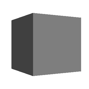
Visual.Type : Primitive
Usage
Here is an example of using a Primitive visual, the actual shape is set via the Shape property.
public int Shape
{
    get
    {
        return _shape;
    }
    set
    {
        _shape = value;

        // Create and Register Primitive Visual
        PropertyMap primitiveVisual = new PropertyMap();
        primitiveVisual.Add( Visual.Property.Type, new PropertyValue( (int)Visual.Type.Primitive ))
                       .Add( PrimitiveVisualProperty.Shape, new PropertyValue(_shape))
                       .Add( PrimitiveVisualProperty.BevelPercentage, new PropertyValue(0.3f))
                       .Add( PrimitiveVisualProperty.BevelSmoothness, new PropertyValue(0.0f))
                       .Add( PrimitiveVisualProperty.ScaleDimensions, new PropertyValue(new Vector3(1.0f,1.0f,0.3f)))
                       .Add( PrimitiveVisualProperty.MixColor, new PropertyValue(new Vector4((245.0f/255.0f), (188.0f/255.0f), (73.0f/255.0f), 1.0f)));
        _primitiveVisual =  VisualFactory.Get().CreateVisual( primitiveVisual );
        RegisterVisual( PrimitiveVisualPropertyIndex, _primitiveVisual );

        // Set the depth index for Primitive visual
        _primitiveVisual.DepthIndex = PrimitiveVisualPropertyIndex;
    }
}
Properties
| PrimitiveVisualProperty | Name | Type | Description |
|---|---|---|---|
| Shape | INTEGER or STRING | The specific shape to render. | |
| mixColor | VECTOR4 | The color of the shape. | |
| Slices | INTEGER | The number of slices as you go around the shape. More info | |
| Stacks | INTEGER | The number of stacks as you go down the shape. More info | |
| ScaleTopRadius | FLOAT | The scale of the radius of the top circle of a conical frustrum. | |
| ScaleBottomRadius | FLOAT | The scale of the radius of the bottom circle of a conical frustrum. | |
| ScaleHeight | FLOAT | The scale of the height of a conic. | |
| ScaleRadius | FLOAT | The scale of the radius of a cylinder. | |
| ScaleDimensions | VECTOR3 | The dimensions of a cuboid. Scales in the same fashion as a 9-patch image. | |
| BevelPercentage | FLOAT | Determines how bevelled the cuboid should be, based off the smallest dimenson More info | |
| BevelSmoothness | FLOAT | Defines how smooth the bevelled edges should be. | |
| LightPosition | VECTOR3 | The position, in stage space, of the point light that applies lighting to the model. |
VisualMap : PrimitiveVisual
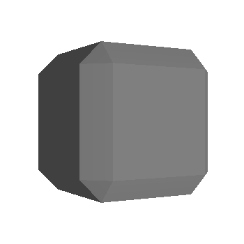
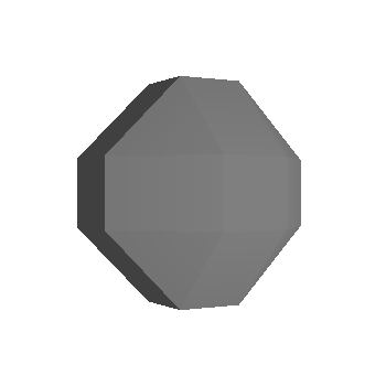
Shapes
There are six shapes that can be chosen, some of which are simplified specialisations of another.
| Enumeration | Name | Description |
|---|---|---|
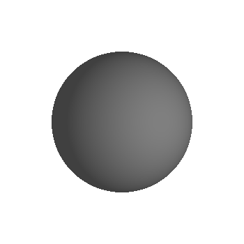
| Sphere | Default. | |
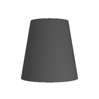
| ConicalFrustrum | The area bound between two circles, i.e. a cone with the tip removed. | |
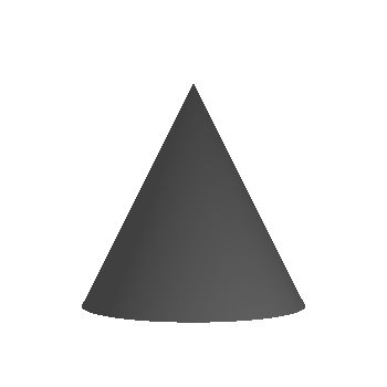
| Cone | Equivalent to a conical frustrum with top radius of zero. | |
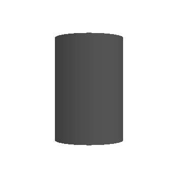
| Cylinder | Equivalent to a conical frustrum with equal radii for the top and bottom circles. | |
| Cube | Equivalent to a bevelled cube with a bevel percentage of zero. | |
| Octohedron | Equivalent to a bevelled cube with a bevel percentage of one. | |
| BevelledCube | A cube/cuboid with all edges flattened to some degree. |
Examples below:
sphere:
conics:
| Frustrum | Cone | Cylinder |
|---|---|---|
 |
 |
 |
Bevel
Bevel percentage ranges from 0.0 to 1.0. It affects the ratio of the outer face widths to the width of the overall cube, as shown:
| 0.0 ( cube) | 0.3 | 0.7 | 1.0 (octahedron) |
|---|---|---|---|
 |
 |
 |
 |
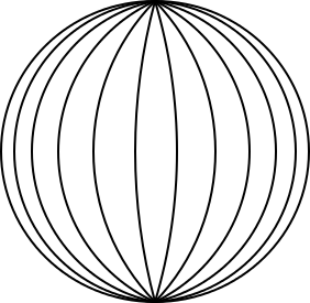
Slices
For spheres and conical frustrums, ‘slices’ determines how many divisions there are as you move around the object.
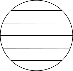
Stacks
For spheres, ‘stacks’ determines how many layers there are as you go down the object.
Wireframe Visual
Renders a wireframe around a quad geometry.
The wireframe visual is mainly used for debugging, replacing all other visuals when ‘Visual Debug Rendering’ is turned on.
Text Visual
Renders text within a control.

Visual.Type : “Text”
Usage
PropertyMap textVisual = new PropertyMap();
textVisual.Add(Visual.Property.Type, new PropertyValue((int)Visual.Type.Text))
          .Add(TextVisualProperty.Text, new PropertyValue(_name))
          .Add(TextVisualProperty.TextColor, new PropertyValue(Color.White))
          .Add(TextVisualProperty.PointSize, new PropertyValue(7))
          .Add(TextVisualProperty.HorizontalAlignment, new PropertyValue("CENTER"))
          .Add(TextVisualProperty.VerticalAlignment, new PropertyValue("CENTER"));
_textVisual =  VisualFactory.Get().CreateVisual( textVisual );
RegisterVisual( TextVisualPropertyIndex, _textVisual );

// Set the depth index for Text visual
_textVisual.DepthIndex = TextVisualPropertyIndex;
Properties
| TextVisualProperty | Name | Type | Required | Description |
|---|---|---|---|---|
| Text | STRING | Yes | The text to display in UTF-8 format | |
| FontFamily | STRING | No | The requested font family to use | |
| FontStyle | MAP | No | The requested font style to use | |
| PointSize | FLOAT | Yes | The size of font in points | |
| MultiLine | BOOLEAN | No | The single-line or multi-line layout option | |
| HorizontalAlignment | STRING | No | The line horizontal alignment: “BEGIN”, “CENTER”, “END” | |
| VerticalAlignment | STRING | No | The line vertical alignment: “TOP”, “CENTER”, “BOTTOM” | |
| TextColor | VECTOR4 | No | The color of the text | |
| EnableMarkup | BOOL | No | If mark up should be enabled |
VisualMap : TextVisual
Visual Transform
The visual ‘transform’ map enables layouting within a control.
The VisualMap class, has ‘policy’ properties to control the transformation.
Transform Type
The VisualTransformPropertyType enum specifies all the transform property types:
| Enumeration | Type | Required | Description |
|---|---|---|---|
| Offset | VECTOR2 | No | The offset of the visual. |
| Size | VECTOR2 | No | The size of the visual. |
| OffsetPolicy | VECTOR4 | No | Whether the offset components are Relative or Absolute More info |
| SizePolicy | VECTOR4 | No | Whether the size components are Relative or Absolute. |
| Origin | INTEGER or STRING | No | The origin of the visual within the control’s area. More info |
| AnchorPoint | INTEGER or STRING | Mo | The anchor point of the visual. More info |
Transform Offset & Size Policy
The VisualTransformPolicyType enum specifies policy types that could be used by the transform for the offset or size.
The offset and size policies can be either Relative or Absolute.
| Enumeration | Description |
|---|---|
| Relative | Default. The size or offset value represents a ratio of the control’s size. |
| Absolute | The size or offset value represents world units (pixels). |
For example, an offsetPolicy of [ RELATIVE, RELATIVE ], a sizePolicy of [ ABSOLUTE, ABSOLUTE ], an offset of ( 0, 0.25 ) and a size of ( 20, 20 ), means the visual will be 20 pixels by 20 pixels in size, positioned 25% above the center of the control.
Visual Alignment
The AlignType enum specifies the visual alignment:
| Enumeration | Description |
|---|---|
| TopBegin | Aligns to the top of the vertical axis and the beginning of the horizontal axis (The left or right edge in Left-To-Right or Right-to-Left layouts, respectively) |
| TopCenter | Aligns to the top of the vertical axis and the center of the horizontal axis |
| TopEnd | Aligns to the top of the vertical axis and end of the horizontal axis (The right or left edge in Left-To-Right or Right-to-Left layouts, respectively) |
| CenterBegin | Aligns to the center of the vertical axis and the beginning of the horizontal axis |
| Center | Aligns to the center of the control |
| CentreEnd | Aligns to the center of the vertical axis and end of the horizontal axis |
| BottomEnd | Aligns to the bottom of the vertical axis and the beginning of the horizontal axis |
| BottomCentre | Aligns to the bottom of the vertical axis and the center of the horizontal axis |
| BottomEnd | Aligns to the bottom of the vertical axis and end of the horizontal axis |
Example of a Visual Transform
Here is the corresponding code sample, for the image visual:
OnRelayout(Vector2 viewSize, ....)

...
...

// Configure the transform and size of Image visual.
PropertyMap imageVisualTransform = new PropertyMap();
imageVisualTransform.Add((int)VisualTransformPropertyType.Offset, new PropertyValue(new Vector2(10.0f, 0.0f)))
                    .Add((int)VisualTransformPropertyType.OffsetPolicy, new PropertyValue(new Vector2((int)VisualTransformPolicyType.Absolute, (int)VisualTransformPolicyType.Absolute)))
                    .Add((int)VisualTransformPropertyType.SizePolicy, new PropertyValue(new Vector2((int)VisualTransformPolicyType.Absolute, (int)VisualTransformPolicyType.Absolute)))
                    .Add((int)VisualTransformPropertyType.Size, new PropertyValue(new Vector2(40.0f, 40.0f)))
                    .Add((int)VisualTransformPropertyType.Origin, new PropertyValue((int)Visual.AlignType.CenterBegin))
                    .Add((int)VisualTransformPropertyType.AnchorPoint, new PropertyValue((int)Visual.AlignType.CenterBegin));
_imageVisual.SetTransformAndSize(imageVisualTransform, size);
The code for the other visuals in OnRelayout is similar. Although note that the OffsetPolicy for the text visual is VisualTransformPolicyType.Relative, in both axis.
The Visual Map class
The VisualMap class is the ‘base class’ for each visual.
The VisualMap class encapsulates properties for visual size and offset, depth index, shader, ‘mix color’, opacity etc. as well as
the Transform map of a visual.
Here is part of the ColorVisual derived class
   public class ColorVisual : VisualMap

...
...

   private Color _mixColorForColorVisual = null;

   public Color Color
   {
       get
       {
           return _mixColorForColorVisual;
       }
       set
       {
           _mixColorForColorVisual = value;
           UpdateVisual();
       }
   }
The VisualMap class also contains an output visual map, used in visual creation.
Here is an example of using this output map to create a visual:
var colorMap = new ColorVisual{Color=Color.White;};
var _colorVisual = VisualFactory.Instance.CreateVisual(colorMap.OutputVisualMap);
RegisterVisual(ColorVisualPropertyIndex, _colorVisual);
In this next example the visual is created from the visual map in the Background property.
ColorVisual colorVisualMap1 = new ColorVisual();
colorVisualMap1.Color = Color.Green;
_visualView.Background = colorVisualMap1.OutputVisualMap;

window.GetDefaultLayer().Add(_visualView);
Visual maps have a custom shader property.
The Visual View class
The VisualView is derived from the CustomView class, and enables the addition of any visual.
public class VisualView : CustomView
Here is an example of setting up a VisualView:
_visualView = new VisualView();
_visualView.ParentOrigin = ParentOrigin.TopLeft;
_visualView.PivotPoint = PivotPoint.TopLeft;
_visualView.Size = new Size(window.Size.Width, window.Size.Height, 0.0f);
Gradient Visuals shows an example of adding a gradient visual to a VisualView.